Wednesday 30 April 2014

Preliminary 2cool4scoolmag


"The Whitley WAVE!
The worlds number one magazine... EVER!

"In this issue
Ross whyatts mum speaks out!
'I am soo... so sorry'

LOL!
Lots of learning
revision guide

Can you dig it
History students go on a fossil dig

Who cut the cheese
Adam 'cheddars' Chedburn retires

New to school
Poppy Preston
Coming from Essex

Find out which Year nines are "dating"
pages 19 - 43"


"The Whitley WAVE

Whitley wave of the day!

pg3 Twerking hard or hardly working. Dance exams soon

pg 4 Chemistry students in their element

pg 5 Art students n love are drawn together

This was my initial task set..."

I had week to do this and i had just learned the basics as a first go I am chuffed...

A few things to mention, sorry about the puns, this was my first project and I wanted to have fun with it. Second of all this was an experiment for my final piece, I used this piece to explore the ins(-designs) and outs of indesign...

I chose Blue because that it Whitley highs main colour associated with the school. I decided to used light blue on the main body to make text easier to read (that went well :/) I decided dark blue for my header as i thought  it would look good next to white text, which Whitley high use alot. and... IT DOES! (Yay i did something right!)

Next the image, and even though it is dark, thanks to a lying PC monitor, its looking goood! First off my first ever proper crop and I did good! Ross the model (thank you btw)  has a spiky head curve that is hard to crop, but I used the magnet lasso and the magic want to erase all the outer crud and was left with a model. To increase brightness, I did believe it or not, I use photshops contrast too and that made him visible, which is a start.

Mistakes were made with the3 red text, Red and black don't mix unless you are dennis the menace, lesson learned. The black and red are too dark for each other, I had no contract, mabye next time I will use a pale orange instead of the red, no only to compliment the black, but also to make direct contrast with the blue.

The new to school section I like as it is poppin'! some would say 'poppy is poppin'. But i would have to hit them. I want to do some fake standout stuff on my main music mag.

The contents page is a bit messy But i the the images.

 Shouldah wouldah couldah AKA: What I would change

Text size smaller, for more content and 'neatliness'

Lighter text for easy reading

picture brightness, you can see why

Smaller header (more like 1/4 pager)

The font... STENCIL! WHAT WAS I THINKING!

Overall though I am quite happy


Aah! A zombie! Oh wait...


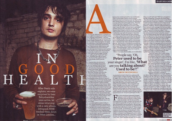
Everyones favourite heroin powered corpse, Pete Docherty makes in to NME.

The image is in the style of... well... I guess a family photo this is unusual. HOWEVER! this article is about him leaving rehab. I think the image is supposed to show the REAL Pete. Face t pete you have a reputation. Usually everyone needs to witness you pass to rid the reputation of a messed up, drug induced, pop artist (cough Amy Winehouse cough). However Pete needs to be seen as a real human being instead of a famous person. So using this friendly publish photo seems to be much better than him, let's say, smashing a guitar or smoking a cigarette. Because that would show the wrong message.

Another thing I noticed was the colours, orange, brown and amber are very earthy and real (by real I mean like physical (by physical i mean realistic(by that I mean not man made(e.g. neon)))) Like i said they want a realistic impression they are avoid controversy, everything is 'Plain Jane'

the big quote " People say 'Oh Peter used to be a singer.' What are you talking about?
 Used to be!? This section proves that they are trying to defend Pete by expressing that he is still A singer. I learned form this peice I need to replicate the artist not just on there personality, but what they want to project to their fans

Saturday 26 April 2014

Mojo again (I think the last one went pretty well don't you)

Neil young, he is old, unlike this magazine which was released sometime over the past five years. As I said previously on the MOJO magazine front, they do old music. But still a niche market much like my target market.

Image blends into the text. this seems to be a common code for most magazine DPS's with an exception of a few, for instance muse which I just covered. The image is in black and white this can be for 2 reasons
1 effect:
to contrast with the black background, which is unlike the magazine, bug creates a importance. Neil young is an icon, even if you have never heard a song you have defiantly heard of him.the act he is white also mixes with the white text which looks, in Laymans terms, cool! And it also shows that the text identifies with him. I will probably do this, not with black and white but maybe a primary colour?

2 old:
This picture is old, colour cameras weren't always a thing. put two and two together and you get... Old B&W camera at an old concert.

The text colour is the same gold shown on the MOJO's contents page, I have deduced this must be part of their house style. I will need to find a house stye in my piece to avoid colour clashing.

Something I haven't mentioned is the use of a drop capital. you see that big W, yeah well I did and it is in all the other DPSs, This helps the reader find the first line. When you have a magazine with text jumping all other the place, there is never s certain place to start so the drop capital points out the first line. It might also be an link to when documents all used to start with a drop captital


This is a double page spread by Q on the band MUSE. In this DPS The image is clearly divided by the page divider. I don't like this as it gives a sense that the article doesn't link. The image again features primarily the singer, much like the front page. The drummer and bassist are not directly looking at the camera, this happens in almost every solo shot, however in the band shot only one, this is most likly dur to the fact that he is the face of the band, the singer and the guitarist are usually in the limelight more, in this case he is both.

The second image is a poloraoid. Polaroid's and retro photos are very 'IN' now due to the launch of popular social conglomerate instagram, the number one image sharer in the world. Instagram use, filters t give it the hipster edge. I am going to be replicating this as the hipters and indie go together like chips and salt.

The text has a very formal effect. Again this goes against the more messed up and rustic feel. Muse are coming across as very serious which in a way is them. Muse are only known for there music, they are not very public. so the serious feel actually suits them, however i still looks very news-papery.

The text is very much like there music. As you can see in the text in red "it can't be a coincidence that we are a band of misfits" Muse are an alternative band, there music has no general classification they are known for there synthesising of genres including 'space rockprogressive rockalternative rocksymphonic rock and electronica'(thanks wikipedia).

What i have learned from this DPS is that a DPS needs to replicate the bands tone and identity in aesthetic and structure.


Lil' Allen

The article links with the title page of NME. It has the same over house style of the front page.

The image is on the right hand side of the 2 pages which is VERY unusual, however... this suits the artist. She is a very 'RISKAY' artist subversing the typical female artist standard. First off, the clothes, She is wearing a really baggy tarten. Usually the girls are over sexualised, showing skin and popping cleavage. How ever Lily is the artist who has the guts to say no to this stereotype, well that is what her clothes say about her. Everything about this article is abnormal, the amount of columns 4!? Unique text sizes!? It's just crazy.

The fact  That this article is so subversive is great!.. but not for me. this is a poor style model to follow as itself doesn't follow a trend!

Tuesday 22 April 2014

Florence and the double page spread

This double page spread is very Q,
It follows general conventions of DPS's 3 coloums, BIG text and one giant picture. The image is big and tight, however there are a few things I would change (more on that later. The image follows the grid rule, her 'lady lumps' are in direct line with the text, "sex sells" A few other things are on the grid.

Face

Her face is on the direct 1st column line

Got the love

This caption is on the top horizontal line

Drop Capital

The drop capital hits the inter section of the bottom horizontal line and the right vertical line

The fact these hit the lines show just how precise the image was whilst being taken. The attention to detail will be hard to replicate (I'm only one man damn it!) but I will give i t a go

The text is in three columns I noticed this was not only a trend but it is also a code. The is just the right size not to be overwhelming but not seem so short. I will HAVE to do this in my magazine as this is done in almost 99% of typical magazines.

Pun - USA got the love. It seems like the writing has to be witty when in comes to grabbing reader attention, this is somthing I ntend to follow. Big text means big voice i guess...

Colours are very contrasting, Florence wears black and the rest of the document is white or light grey. This means she stands out as well as the text. As the subject of the text Florence needs to "blend out" with everything. Also the use of red on the flag  and her hair mix so she doesn't seem so out of place.

The image is also a metaphor, Athe flag representing america and she is sitting on it so she is "on top of America".


Contents quickies

This is just like the other NME same everything really. The only thing different about NME's contents page is the unique colours on the band index section. However i hate this. It looks like someone did this on Windows 3.1. This shoddy looking index is very off putting. I find that the colour scheme of red white and black still stumps Q's red and white as the black has more effect and adds more life.

Sunday 20 April 2014


First off.. I like space
Secondly, These are ideas for my main band to work with.
You are probably wondering hey Adam 'Music man' Shorthouse, those last 3 fonts are all the same. Well you handsome devil you are correct... Thats because in my brain storming section I LOVED that font, it is so techy and sleek! Very futuristic (just like what I want) I think I will go for Lunar parade, You can see Moon parade and lunar parade are very similar, and that is because as I was putting tha final e on parade i stood up and shouted "LUNAR IS A COOLER WORD!" (true story, I am ashamed). Anyway I am thinking of having the font in a spacey galaxy colour like a bright purple... we will see.

Some patterens, for logo. 1 and 5 are just abysmal and we don't like to talk about number 4 but 3 and 4 have potential, I think it depends on what the magazine looks like at the end. pencil fairy stole my colours so B&W will have to do... but i do like the B&W with lighter shades of grey in the centre.

Saturday 19 April 2014

"A new challenger approaches!" MOJO

I wanted to get a look at a magazine that does what I intend to not do, if that means anything. 
MOJO has a set niche audience for older audiences that like classics. You can see her tat Gene simmons from KISS and Pink Floyd where mentioned. This clearly shows that MOJO has a set audience. KISS was finished with in 2001 after their 13 month farewell tour. So a magazine section on KISS would be unheard of in a modern music magazine, such as I intend to do.However we both a niche market and that makes us similar
. First lets look at the image. Its big, real big it takes up the whole section This is unusual for a magazine to do... IF you are NME and Q. I won't do this but I will tell you why this WORKS for mojo. First off Rock is BIG and this Picture is big, And by big I mean Rock has always been about loud music, large venues and High levels of controversy (see this for proof http://www.biblebelievers.com/Rock1.html ) So the large over baring  picture works!. For my magazine which will feture a smaller band a large image will come across as cocky, obnoxious and uncalled for. My band as up and comers don't have the right do act like this just yet.

And now the text The text blends into the photo and this looks fantastic. I haven't seen it done on any magazine I have read before. It gives a very retro vibe that links in with the style of music, and I want to do this, but not like this. I need to define my text in a way to replicate the day and age my music based in. So... modern music... modern out look. The colour sheme also looks very vintage, Yellow on white can often be risky do to contrast reasons however the sand tone leaves it looking gritty and rustic.


Thursday 17 April 2014

It seems like Q have a bit of a theme going.


Q have developed a idedic style of contents page. first lets look at the features section. This section looks almost identical to the previous Q mag I looked at. except on thing. The colour them of the issues exclusive. The previous mag had a gold theme for Oasis, which took to the contents page. In this section it is womans music and the gold has been replaced with a grey teal. I will be using this in y actual magazine, possibly features but i am un-decided. . However in this section the magazine, the numbers are not in a unique colour. this suggests that tho oasis issue is a specialist issue. The font size is still the same, medium header and small sub-text.

However apart form the features coloum, nothing else is different about the layout of text and images, I have notice the picture in the contents page has no gimmicks. For instance in the front page, they are being all dramatic and moody, but the contents page has photos of the band or artist just... well... there! I have noticed this. the editor must do this for the sake of people who don't know the band all to well. Because Florence in the machine is no always feeling her face and has her hair all stood up. This picture gives the honest look for the band so in my contents page I am going to make my band typical and basic, no moody gimmicks just an honest look at the band members.

Review section is a recurring factor for Q, this seems to be the most noticable thing to distinguish each magazine by contents page, Q does reviews, NME do band index's, and other magazines do other things. I have no idea what I want to do with my section honestly. I think when it comes to the time I will decide.

What do I not like?
Well... this is boring, this content page is boring. Like incredibly boring. The epitome of boring. The contents page is to formal for a music magazine! I mean comon music is supposed to not be formal. Music used to be about not conforming an what not but this magazines contents page just doesn't have enough OOMPHF! Each section is too even, to grey and too even. When I make my contents page I will make in much less political debate and more music!


Front page quickies 2

I chose this style model to show what a front page looks like with a band of three which i intend on doing. One member at the front and to at the back. At the front is the lead singer of muse. It seems the magazine whats to focus on him. Matthew Bellamy is the lead singer of muse and is the face for the band. It is often the lead singer get's the lime light, for instance Lennon and McCartney, Alex Turner, Gene Simmons are the known members. To replicate this style I am going to put one of my models in front of my others. I am probably going to also replicate the use of clothing. The leads clothes are brighter and moer noticaable than the others

Tuesday 15 April 2014

NME magazine This is VERY unusual First off the contents is on the right hand side. I don't like this, neither does my Mum. The descriptions and titles are not aligned  this leaves the edge jagged .

 Maybe if the text has a left alignment
Like so...

The band index is somthing very unusual. As a reader of magazines that are not NME this leaves me in an irate state. Does this mean featured bands of all time, this issue, random bands? I don't know. This is neither a code or convention of other magazine. 

The main image is smaller than Q's. This is most likely because there is less space. what is unusual about this photo is the fact it is central. Cetral images are very unusual as they are not space friendly. News papers, sites social media's often refrain from this to the main image, as it is not space conscious especially on one page. 

The colour scheme I think is much better than Q's, Whilst similar colours, NME used Black more for just contest the black section is hold yellow text. this creates a very visible, noticeable and stands out! This is somthing I want to replicate as it works in all the right places. 

Sections is something NME takes seriously 5 levels to Q's 3. it seems NME has more varied content then Q. NME must have a more varied audience. the people who like all type of music (yeah i hate them too!) But none the less experimenting with sections is somthing i intend on doing !

HDD

Here! I found the my hand drawn designs!

As you can see I kept it pretty much pitch perfect for the front cover. And for my double page spread it is pretty similar aswell. contents page not so much (still having trouble with it) . Anyway i'll give you a look, there is not much  to explain really. Ill compare them with my final draft later!


Monday 14 April 2014

This is the contents page of Q. it is using the blocky, dual column method to display the contents. The left column is exclusively text.  It is divided into multiple sections Features, Issue specials and monthly regulars. this text is medium to small size. The small size is prominent in terms of colour as it it's text is divided by title and subtext by hue and colour. The header is in a deep black whilst less important text, descriptions, are in a grey. the use of contrast draws the reader to all the right places. readers will notice the black over the grey as its is more prominent in the eyes, this means regular readers will be able to pick out all of the headers and know where that articles they want to read are. Studies show that 50% of articles are NOT read in purchased magazines ((Source: Forbes Magazine) there is so much irony there!). this will be replicated in my magazine.

The main image is only one article. And takes up 1/3 of the page space. This seems to be a convention as many magazines do this and Q love it! They do this as it is a feature article, exclusive, what ever you want to call it. The picture is the whole description. The limited text comes in its own size of large to medium. This seems to be the most dominant article. I will be replicating this, mabye not to that scale, but we will have to wait and see!

The bottom section is where Q get original. They use this space to make a review! This is unusual because this space is a mystery to me, sometimes its a review, editors notes or even more page numbers.  When I replicate a contents page I have no idea what I will do.

Colours. This magazine uses Q's colour red and the always acceptable white and black. This surprises no one. Q is very proud and likes the idea of minimalism. This single exception is the gold but this is a typical thing to come from a magazine. This is to make it stand out. Oasis is band royalty so gold seemed suitable. However I feel like Q made a mistake. Gold on white doesn't read well, especially for colour blind, long-sighted. I will not replicate this gold and white fiasco.

Sunday 13 April 2014

This time NME has gone on an approach that reflects the artists personality. ily Allen is known for her explosive outbursts, drunken solo whammies and not caring what anybody think. ME uswd this to their advantage. 'LILY ALLEN TAKES ON THE WORLD' written in a ransom note, cut out of magazine (ironic huh) block letter style.This reflects Lilys darker side to her career. Along with the text, to which reprosents her persona, we have the colours. Lily is wearing red and has white skin and black hair. Almost every thing is in these colurs. EXCEPT the yellow. The yellow is used to make certain things stand out. For instance. it would be hard to notice David Bowie in the top as he blends in. But surround it in yellow, which stands out and counteracts with the other colours,  he is clearly seen. I will be replicating this especially in text.

The photo is very unique in replicating the tone of the main article. The photo is very offensive (not in terms of offending) the is poised in an aggressive manner. This pose is a signal to the reader depicting what will happen in the article. Make up on her eyes make them stand out and the slight head tilt hits at her emotion.

Text take place at the side of the article. This leaves room for the main text body "Lily Allen takes on the world" and room for the main image of Lily. They also contrast the other colours with the yellow. The yellow colour is a sub-colour so it is only used when necessary. I will be doing this in my my mag as It, well, WORKS!

What is unique is the fact that the logo isn't in the direct corner. I will not be replicating this as this is neither a code nor convention.

Saturday 12 April 2014

NME front cover (feat: the Maccabees)

The time the logo is situated behind the band. This is another on of the three methods  of displaying a title. what is also odd it the fact NME have altered the colour of there title.
NME have abandoned their Red, white and black title to fit to the taste of the band, their
 cloths and background. NME as substituted in the plain black text instead of their typical red shadowed text. This is something I will now think about replicating. I will create a logo around this issue I want to make instead of the magazine, this level of freedom is something I will use to my abrupt advantage.

The colour of this issue is white an hot pink. The band Are wearing relatively dark coats and the contrasts with the red of the issue. the pink can also be trased back. the punk era imbraised pink and black. Y+This issue also mentions that it is celebrating 80's in which punk thrived. Another colour trend is white. All the magazines I have seen so fare seem to use white. Even if text is on a white background NME give it a solid block colour background (e.g.Exclusive new track) .

The main image is a full body shot of all the band members. The members have been organized into a triangle pattern resulting in the singer (face figure for the band) to be in front. this allows the magazine to grab readers attention by refuring to their most known member.

This suits the target audience of readers. NME is a music magazine for hardcore music lovers content is unvaried as it focuses directly on music based content. This is reflected in the front page. Harsh colours featured in rarer music house styles like 'Hot pink' which is primarily used in the like s of indie rock and punk. This colour is used to show that this magazine means business and needs to be taken seriouly by a serious music loving audience.